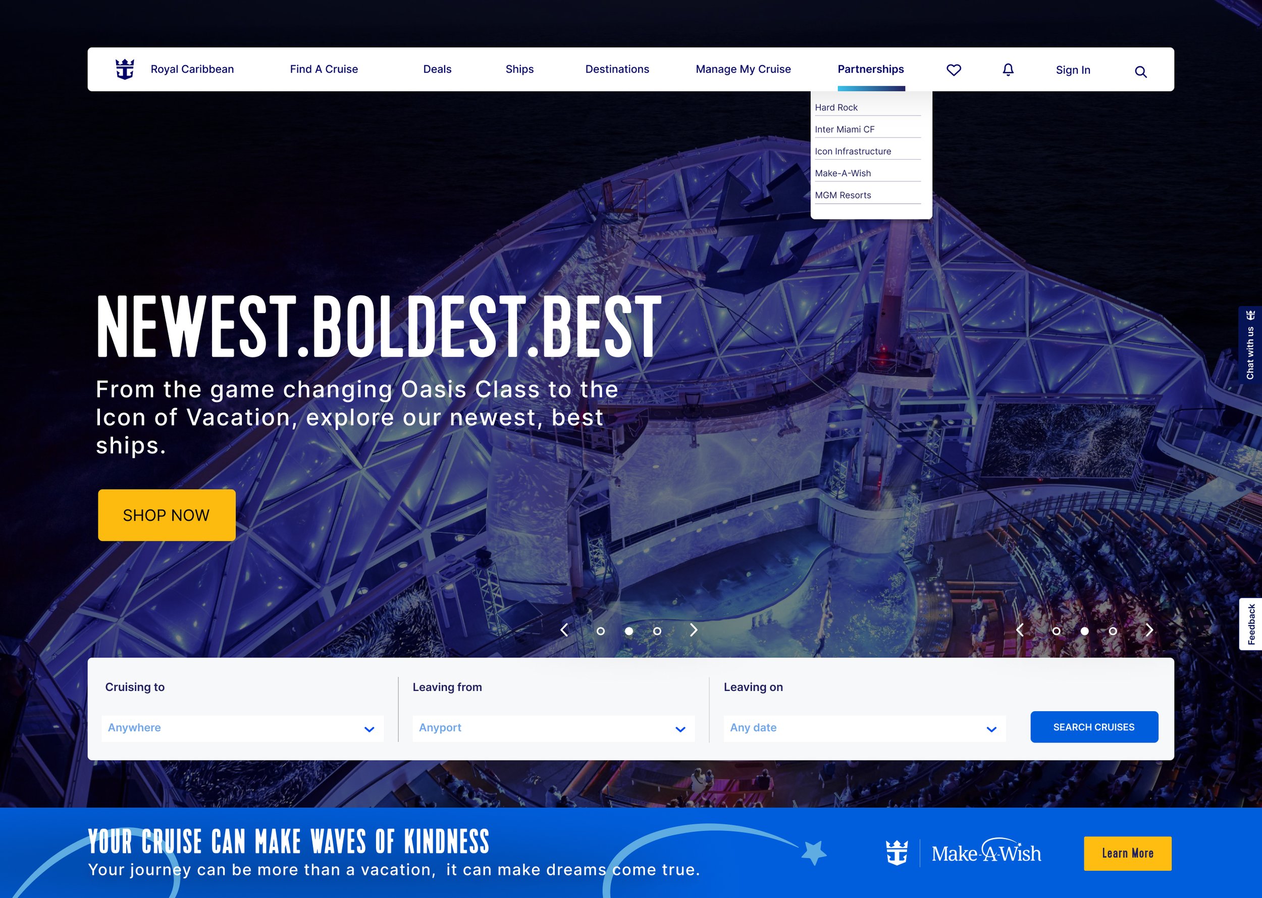
Royal Caribbean x Make - A - Wish
This 5-day Design Sprint, part of a competitive challenge where our team earned 1st place, focused on seamlessly integrating the Royal Caribbean and Make-A-Wish partnership into the cruise booking experience.
Our goal was to build trust, inspire donations, and highlight the transformative impact of the partnership, all while maintaining the Royal Caribbean brand's tone and design consistency.
Project Length
5 days
My Role
End- to - End Designer
Year
2024
Tools
Figma, Google Meets, Otter.ai, Figjam
The Challenge
Potential donors hesitate due to a lack of trust, unclear donation impact, and insufficient incentives. My team found that the new partnership with Make-A-Wish lacks proper visibility on the Royal Caribbean website, hindering its ability to communicate its impact and inspire donations effectively.
The Solution
We designed an innovative web experience that seamlessly integrates donation opportunities within the partnership tab, adds a banner highlighting the new collaboration at the bottom of the hero image, and incorporates donation options during the checkout process. This approach not only enhances the visibility and impact of the partnership but also aligns with Royal Caribbean’s business strategy by driving sales, increasing donations, boosting brand awareness, and strengthening the unique value proposition.
Our solution includes a high-fidelity prototype featuring a user-friendly donation flow, real-time updates on wishes granted, and personalized incentives for donors. By streamlining the donation process and emphasizing the program’s impact, we created an inspiring, emotionally engaging experience that motivates users to take meaningful action.
Our Approach to the Challenge
To address the problem effectively within a 5-day timeframe, we structured our approach around key phases of the design thinking process.
This allowed us to work efficiently while iterating on our ideas. We divided the process into four focused stages: Mapping, Sketching, Deciding, and Prototyping and Testing ensuring a clear and productive workflow to tackle the challenge.

Day 1: Map
We kicked off the sprint by diving straight into research, conducting interviews with frequent cruisers and examining successful partnerships between Make-A-Wish and other hospitality companies.
We also explored how other organizations have collaborated with nonprofits to understand the key elements that made these partnerships successful. This comprehensive research laid the foundation for developing a user-centered solution.
Research Process
We conducted interviews with frequent cruise-goers to uncover user needs and preferences, while analyzing successful for-profit and non-profit partnerships to identify best practices.
These insights helped shape a solution tailored to user expectations and business goals.
Interview Findings
To gather accurate insights, we interviewed five frequent cruise-goers, revealing that they are more likely to donate during the checkout phase when they’re already excited and in a spending mindset. This moment amplifies their emotional connection to the trip. Additionally, a personalized message after checkout reinforces their positive feelings, making them more likely to donate again.
These findings were crucial in understanding user behavior and emotions during the booking journey, allowing us to tailor our approach to align with their mindset.
Market Research
Through our market research, we analyzed successful partnerships involving Make-A-Wish, as well as campaigns from other travel companies, to understand what made them effective. We found that these campaigns leveraged emotional storytelling, impact-focused landing pages, and strategically positioned CTAs to encourage donations.
Drawing from these insights, we focused on enhancing the visibility of the Royal Caribbean and Make-A-Wish partnership, ensuring donation opportunities were integrated seamlessly into the booking journey without disrupting the user experience.
The Problem Identified
After analyzing the research, we identified that the Royal Caribbean partnership with Make-A-Wish lacks visibility at key touchpoints, such as the homepage and booking process, making it difficult for frequent cruise-goers to easily donate.
Design Challenge
How might we amplify the visibility of the Royal Caribbean and Make-A-Wish partnership by seamlessly integrating opportunities into the booking journey so that frequent cruise goers participate in making donations.
Our Target User
Meet Brittany, a frequent cruise goer.
After completing the interviews, we developed our user archetype, Brittany, to encapsulate insights from our research and interviews. This persona provided a user-centered perspective, guiding us in crafting solutions that align with real user needs and behaviors.
Developing this persona enabled us to ground our design decisions in real user needs, ensuring that our storytelling and donation flow effectively addressed their concerns while fostering trust and confidence throughout the experience.

Day 2: Sketching
After identifying the problem and understanding user needs, we transitioned into the ideation phase of the sprint.
Each team member contributed by sketching potential solutions, envisioning key screens such as the landing page, donation opportunities integrated into the checkout process, and a personalized message to reinforce the donor’s impact post-donation.
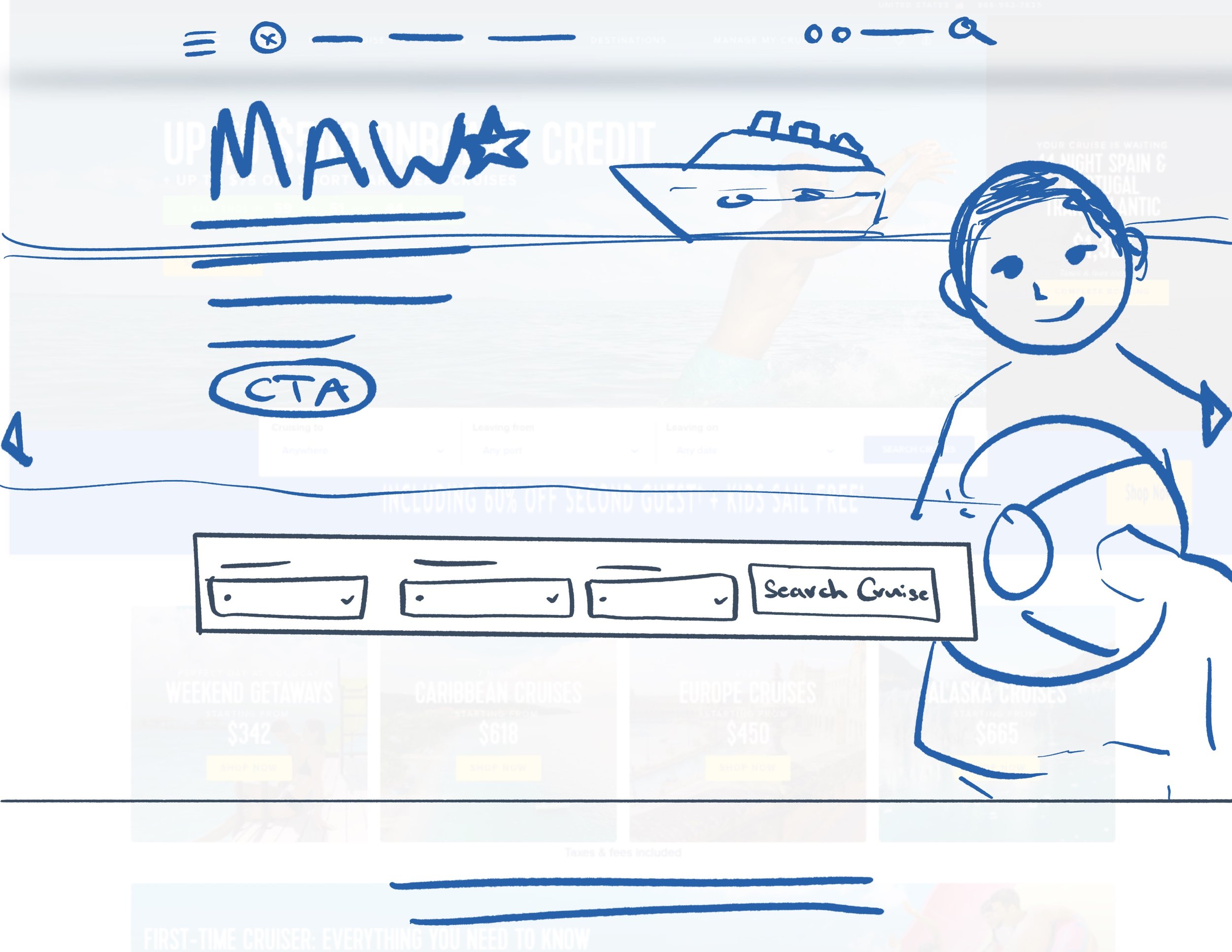
Sketches - Home Page
We designed the landing page for the Royal Caribbean and Make-A-Wish partnership, drawing inspiration from existing partnership pages to maintain a cohesive and intuitive user experience.
We aimed to highlight the new partnership by incorporating a dedicated tab and a banner at the bottom of the page to showcase the collaboration. While we initially considered featuring the partnership in the hero image, we ultimately decided against it, prioritizing Royal Caribbean's business objectives as a for-profit company and ensuring the design remained aligned with their brand strategy.
Sketches - Donation Opportunities
From our interviews, we gained the insight that users are more likely to donate during the checkout process, especially when incentivized. Based on this finding, we ideated a donation opportunity integrated into the checkout journey.
For instance, within the dining options selection, we conceptualized a "Make-A-Wish Dinner" option, allowing customers to select a special dining experience while simultaneously making a donation.
Sketches - Checkout
Our checkout sketches prioritized incorporating storytelling early in the flow to establish trust and create an emotional connection to the partnership.
We used impactful visuals and messaging to introduce the campaign in a thoughtful way, avoiding an immediate donation request.
Donation options were strategically presented later as optional add-ons, ensuring a seamless, non-intrusive experience while fostering a meaningful connection to the cause.

Day 3: Deciding
On the third day of the sprint, we entered the Decide phase, where we refined our ideas through brainstorming, collaboration, and prioritization. After evaluating our options, we decided to create a dedicated partnerships tab on the homepage, along with a banner to highlight the collaboration.
We also designed a landing page and integrated donation opportunities throughout the booking journey, ensuring the partnership was visible without disrupting the user’s booking experience.
Visualizing Brittany’s Journey
We created a storyboard to visualize Brittany's journey throughout the booking process, illustrating how she becomes aware of the partnership. By the end, she feels confident and inspired to contribute, either by purchasing a Wishes at Sea dinner or making a one-time donation.
The confirmation leaves her with a sense of fulfillment, knowing her contribution is making a positive impact, further reinforced by a personalized thank-you message.
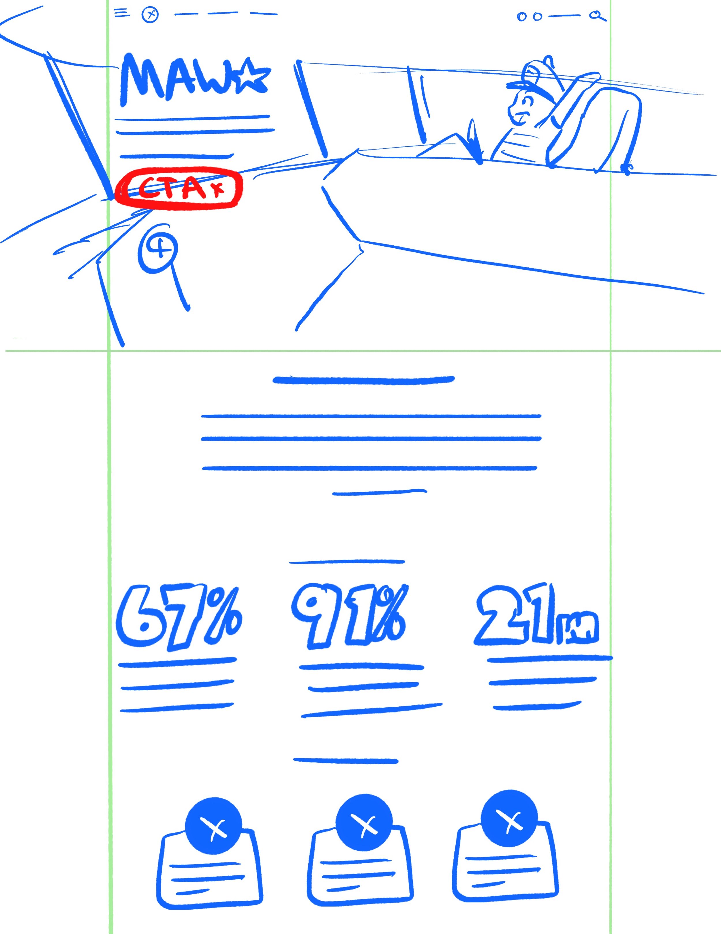
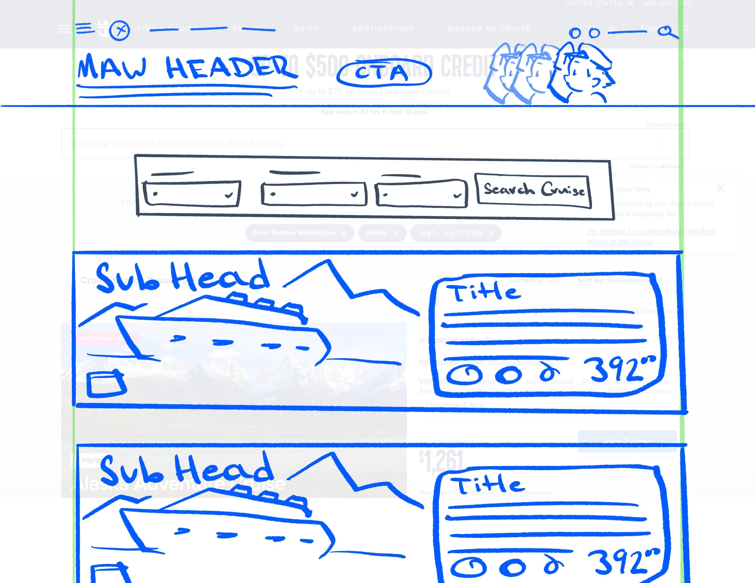
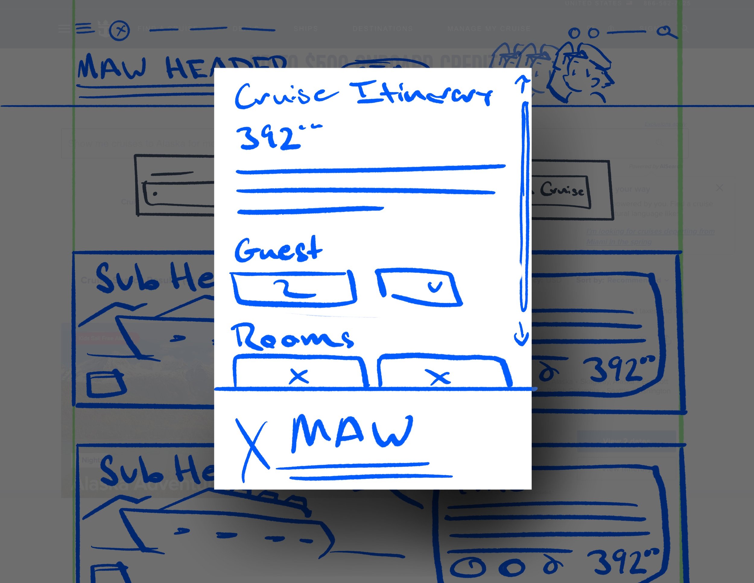
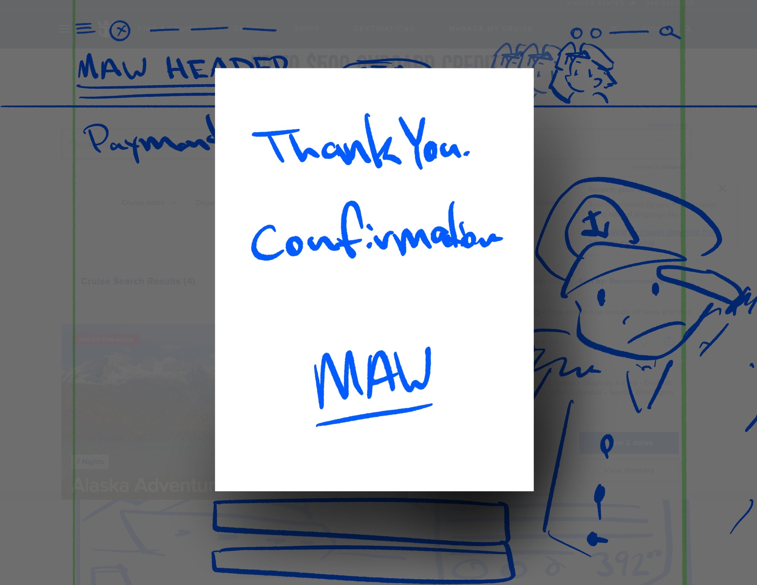
Solution Sketches
We created a set of solution sketches to visually represent our approach and solution to the problem. Our focus was on incorporating impactful imagery, clear statistics, and prominent call-to-action buttons.
This approach ensures the visibility of the Make-A-Wish campaign while maintaining alignment with Royal Caribbean’s branding. Sketching was crucial for us to rapidly explore multiple ideas, iterate efficiently, and identify the most effective way to convey the partnership, all while enhancing the user experience.

Day 4: Prototype
The prototyping stage is where the real magic happened. We took our sketches and brought them to life, transforming them into a high-fidelity interactive prototype in Figma.
We kept the collaboration flowing seamlessly, ensuring the whole team was on the same page every step of the way about how we wanted the design to look and feel.
Redesigned Home Page
For the homepage, we decided to keep Royal Caribbean's original layout intact, so loyal customers wouldn’t be caught off guard by a drastic redesign. Instead, we added a new "Partnerships" tab to showcase all the campaigns Royal is involved in.
We also introduced a banner that says, "Your cruise can make waves of kindness," reminding customers that their trip can have a meaningful impact.
Wishes At Sea Landing Page
We crafted the "Wishes at Sea" landing page to match the home page's design, keeping the user experience smooth and consistent while highlighting the campaign's message.
We included a quote from Royal Caribbean's CEO. This not only gives the partnership credibility but also reinforces to customers that this is a cause Royal Caribbean truly supports.
We followed up with impactful statistics showing how the partnership has positively affected children's lives. This transparency builds trust, reassuring users that their donation is making a real difference.
Finally, we spotlight the Loyal Stars program, where donations unlock exclusive perks like VIP event access and discounts. By showcasing these rewards, we give customers an extra incentive to give back, making the donation feel even more rewarding.
The Booking Journey
Based on our interviews, we knew we wanted to integrate donation opportunities into the checkout process, but without disrupting the flow. We steered clear of pop-ups that could interrupt the booking experience, keeping things smooth and encouraging donations without distracting from the customer’s purchase.
We introduced the "Captain’s Wish Dinner" option, complete with a banner that gently prompts customers to consider donating. Plus, in the booking confirmation, we included a celebratory banner to let them know their generous contribution is making a difference. It’s all about keeping the donation experience as rewarding as the trip itself!

Day 5: Test
On the final day of our design sprint, we dedicated our efforts to evaluating our prototype, verifying its functionality, and fine-tuning the design to optimize the user experience.
Before the presentation, we met with Royal Caribbean representatives to gather their feedback and make iterative adjustments. Our goal was to ensure the design aligned with Royal Caribbean's business objectives while seamlessly incorporating the partnership.
Testing Feedback
During testing, we received valuable feedback suggesting minor adjustments to the prototype. Initially, we included an image of the Wishes at Sea campaign in the homepage carousel. However, we were advised that this approach might not align with Royal Caribbean's business priorities, as the homepage carousel is primarily dedicated to showcasing deals and promotions rather than campaigns.
This insight helped us better align our design with the company's goals while finding other ways to highlight the partnership effectively.
Final Results
In the final iteration, we implemented all validated updates, refining the design to deliver a seamless, user-centric experience. This version not only addressed user pain points but also strategically aligned with business objectives, ensuring a balanced solution that met both user needs and organizational goals.
Presentation to Royal Caribbean Design Team
On the final day of the hackathon, we had the privilege of presenting our designs to Royal Caribbean’s Design Team. It was an inspiring experience to tackle a real-world challenge and craft a solution with meaningful impact.
The moment became even more rewarding when we were awarded first place—recognition that left us truly humbled and proud. Knowing that our ideas could genuinely enhance this partnership and make a difference was an unforgettable and heartwarming experience.
Key Learnings
Next Steps
Importance of Strategic Placement
From the outset, we aimed to seamlessly integrate the partnership into the most impactful areas of the website—specifically during the booking journey. Our goal was to introduce the campaign in a non-intrusive way that complemented the user experience. By ensuring the campaign elements were thoughtfully placed—subtle yet impactful—we maintained Royal Caribbean's primary business objective of driving bookings while effectively encouraging donations.
The Importance of Storytelling
Storytelling is key to creating an emotional connection with the customer, making the cause feel personal and inspiring them to take action. By weaving a compelling narrative, we aim to engage users and motivate them to contribute, turning a simple donation into a meaningful, emotionally-driven decision.
Prototyping and Iteration Are Essential
User testing revealed the homepage carousel wasn’t the best fit for the Wishes at Sea campaign, leading us to create a dedicated landing page instead. This change ensured the homepage stayed focused on driving bookings while the campaign received its own impactful space. Prototyping and iteration allowed us to test assumptions, refine our approach, and strike the perfect balance between user needs and business goals.
User Testing with Our Target Persona
Conduct user testing sessions with real Royal Caribbean customers to further validate the design, gather valuable insights, and identify any remaining areas for improvement. This will allow us to refine the experience and ensure it aligns with the needs and expectations of our target audience.
After user testing, we will update the prototype based on the insights gathered, making necessary adjustments to enhance the user experience and address any identified issues.


